Workflow clarity
Helping users better understand where they are, what actions are available, and how different parts of the process connect.

Clarity and structure for a complex internal corporate environment.
Kroll was a confidential enterprise-focused project involving internal systems and operational workflows used in a corporate environment. My role focused on improving usability, structure, and clarity across parts of the experience where complexity and operational requirements created friction for users.
Enterprise systems often evolve over time through accumulated business and operational requirements. As a result, interfaces can become difficult to navigate, harder to interpret, and cognitively demanding. The challenge was to help create a clearer and more structured experience while respecting operational complexity, existing system constraints, internal processes, and enterprise-level requirements.
Helping users better understand where they are, what actions are available, and how different parts of the process connect.
Improving readability and prioritization in areas with high information density.
Supporting more coherent interaction patterns and interface logic across the experience.
Designing for efficiency and orientation in a workflow-heavy environment.
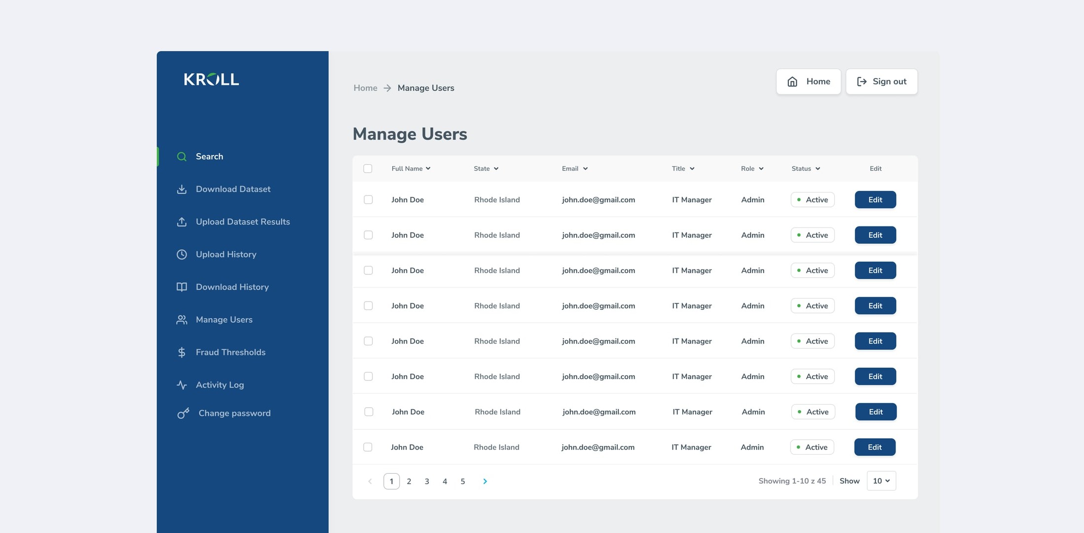
The work required balancing usability improvements with the realities of an already established system environment.
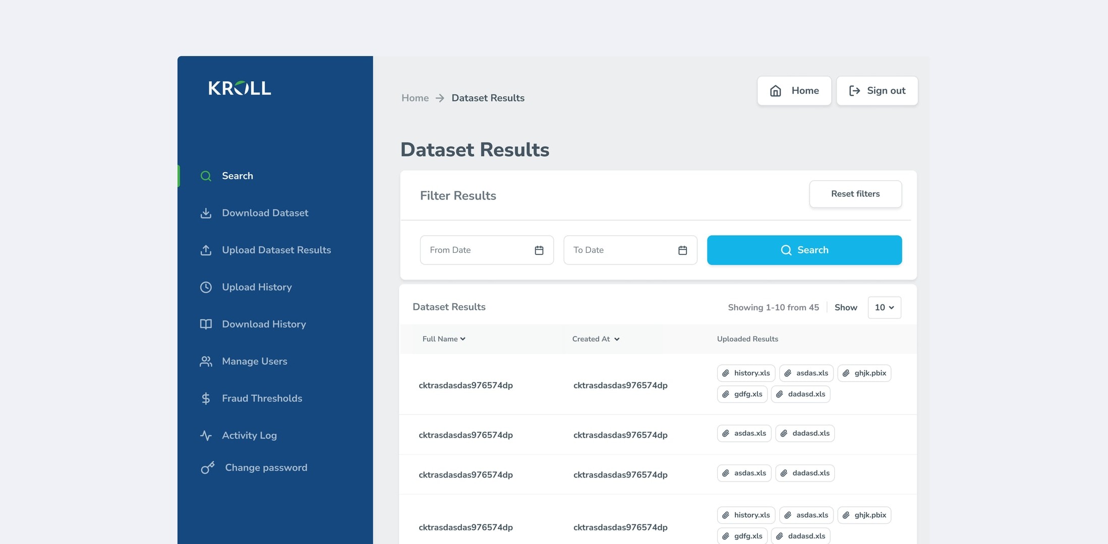
A focused data-review surface made operational outcomes easier to find, filter, and trace without adding more cognitive overhead to a dense workflow.
Confidentiality limits what I can show, so I'll show how I think instead. This is the approach I used here.
In enterprise tools the screen is rarely the problem. The problem is that the screen doesn't match the shape of the task, who touches what, in what order, under what time pressure, and what an error costs.
Dense systems fail at specific moments, after an interruption, at a handoff between two people, when a rare case shows up. Average-case usability is a vanity metric here. The moments of lost orientation decide whether people trust the system.
The instinct is to reduce density. For expert users that's often wrong, they need the density. The real work is making the screen answer "what needs my attention right now" before anything else.
One improved screen creates inconsistency. One improved pattern propagates. In an established system, consistency compounds and one-off polish decays.
Long-time users have built shortcuts that represent real efficiency. Every change I proposed carried a burden of proof.
The system stayed familiar to the people who use it daily while becoming easier to read and navigate. Under the constraints of this engagement, that was the assignment.