Brand-led product showcase
Layouts that give products space and atmosphere without sacrificing browsability.
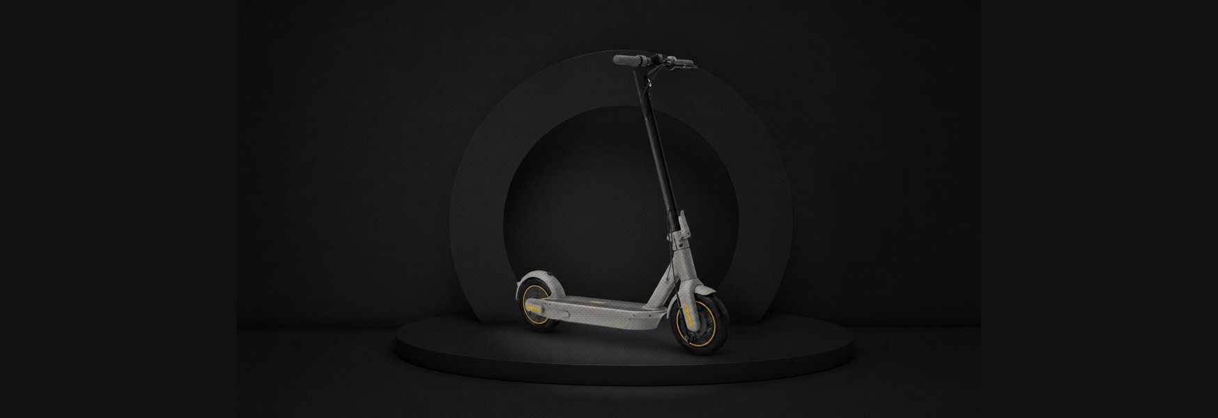
Designing a premium e-commerce experience for the European website of a global mobility brand.
Segway's European e-commerce had to do two jobs that pull in opposite directions, present products with the space and atmosphere of a premium brand, and let people compare and buy across consumer, professional, and enterprise lines without getting lost. Confidentiality limits the visuals here, so the text focuses on how I approached the problem.
Layouts that give products space and atmosphere without sacrificing browsability.
Help users orient across consumer, professional, and enterprise product lines.
Make exploration, comparison, and purchase easier to complete.
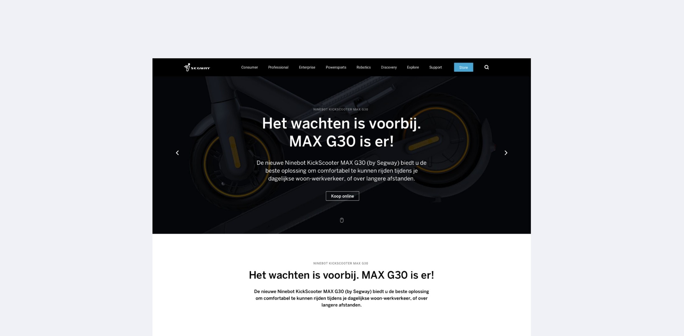
Averaging the two jobs produces pages that do neither, a showcase too dense to breathe, a shop too vague to use. The design keeps two distinct rhythms instead. Brand and product-story pages get space, large imagery, slow pacing. Category and purchase views get density, comparison, speed. The cost is discipline, every new page type needs a clear answer about which mode it belongs to, or the system drifts back into the mush it was built to avoid.
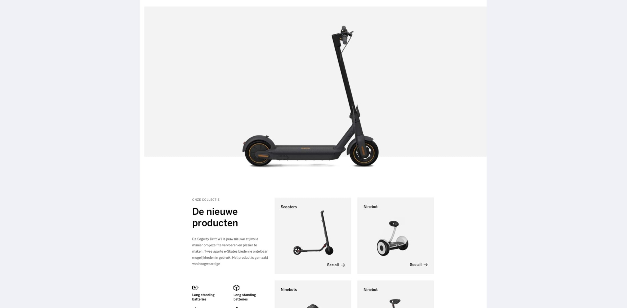
The collection view makes the product range easy to browse without flattening the individual character of each vehicle. It gives customers a clear next step from the campaign into a choice they can act on.
One experience where moving from inspiration to purchase doesn't feel like switching websites. The premium tone survives contact with the shopping cart, which in this category is where it usually dies.